Notes on the front(-end): Designing the website of the Archive of the Digital Present
November 30, 2022
Alexandre Bustamante and Eva Lu
To find the website discussed in this article please visit the Archive of the Digital Present. To read about how the data for this project was collected, see “A Conversation Among Cataloguers: Processes and Personal Reflections on Data Collection” published on the SWB.
Introduction
The way literary readings, talks, interviews, podcasts, book launches, and other types of literary discourses are presented and celebrated has changed dramatically in recent years due to the pandemic. Hundreds of hours of recorded information and data have resulted from online presentations, live recordings, and internet platforms such as Zoom, Youtube, and Facebook. With this in mind, SpokenWeb has chosen to develop the “Archive of the Digital Present” (ADP) as a platform for processing and storing these recorded materials of the pandemic period on a single site that everyone can access. The team working on the front-end development includes the two of us, with faculty and librarian supervision by Tomasz Neugebauer, Jason Camlot, and Francisco Berrizbeitia, and programming by research assistants Sukesh Gandham, Ben Hynes, Max Stein, Mathieu Aubin, Ben Joseph (from SFU), and most recently, Brijesh Lakkad.
The ADP would present content from the Swallow database, an open-source metadata management tool that ingests and allows manual cataloguing of the metadata by SpokenWeb’s collaborators through a user interface. However, further investigation remained necessary: how would end-users of this database have access to the ingested content intuitively and easily? Guided by this inquiry, we mapped a field for exploring another extremity in human-computer interaction (HCI). Adding to the so-called back-end, data-driven Swallow, we, Alexandre and Eva, started exploring the front-end terrain of this system: its public interface, a website.
The methodology for building the front-end design of the Archive was, from an early phase, directed as a user-centred project, which is “the extent to which specified users can use a product to achieve specified goals with effectiveness, efficiency and satisfaction in a specified context of use” according to the ISO 9241-11 (“The Standard of User-Centered Design and the Standard Definition of Usability” n.d.). More freely and user-centred design “ensures that the designs match the needs and capabilities of the people for whom they are intended,” according to Don Norman, author of The Design of Everyday Things (2013), an iconic work advocating for human-centred design.
Norman himself became associated with a particularly confusing model of doors he criticized for their usability – doors that are pulled when supposed to be pushed and pushed when supposed to be pulled – to the point that such doors became known as “Norman doors” (Fig. 1). This frustrating interaction with an artifact, especially the ones that we expect to be “as simple a device as possible” illustrates some principles behind the user-centred design, listed broadly here: effectiveness; efficiency; safety; utility; learnability; and memorability” (Vermeeren, Roto, and Väänänen 2016).

Figure 1. “Norman doors.” An example of an artifact that should be as simple as possible and often generates confusing interaction. Source: (“User-Centric Design: Website Trends in 2016” 2016).
Bringing this concept to our context, users should navigate a website seamlessly and not feel lost or disorientated when they cannot retrieve the information they seek. When this happens, users may be left frustrated, and their initial interest in the site or organization will gradually dissipate and may be met with a negative impression.
With time, user-centred design thinking has begun attributing more and more value to what is recognized as the “user experience”: an emphasis is placed on the emotional interaction with designed artifacts rather than only on their utilitarian performance. This shift has been more clear in the so-called third wave of HCI. As a result, a user-centred approach not only seeks what could be a potential hazard for user navigation but further develops good practices to increase the satisfaction of users’ experiences. This type of approach “requires more empathy and design skills from the designer, and creates new challenges also for research, since UX researchers will also need to expand their scope from analytical studies to creative and generative studies.”(Vermeeren, Roto, and Väänänen 2016).
Therefore, adding to those aspects of functionality and ease of use, the human-centred user experience (UX) design aims to create a digital product that is not only functional but engaging and leaves users feeling pleased about the platform. Websites like the ADP, which are built with respect to this approach, not only target being fully functional but also delve deep into the human experience, which leads to “a different kind of challenge from designing for usability, since avoiding and fixing usability problems are tasks aimed at avoiding negative consequences of using a …system while designing for UX requires looking for design opportunities that may affect people’s emotions in a positive way” (Vermeeren, Roto, and Väänänen 2016).
After initiating the design process, our team’s discussions evolved to experimenting further with the lines of a Participatory Design (PD) approach to the project. The distinction between this method and the user-centred design is that a user-centred methodology is considered executed “on behalf of users,” whilst in PD, it is considered done “with the users” (Spinuzzi 2005, 165). Therefore, by taking this option, we would be engaging a greater involvement of the stakeholders of the ADP in all of the development phases of the front-end design. This approach was pursued in collaboration with other significant aspects of the ADP development project, including planning and development of the software stack (Ben Joseph, Tomasz Neugebauer, Francisco Berrizbeitia), the planning and coding of interactive visualizations (Sukesh Gandham), and overall planning around data faceting, searching, presentation, requirements and functionality (Jason Camlot, Tomasz Neugebauer and Francisco Berrizbeitia, with the whole team).
Since the ADP will be a host platform for presentations, talks and a wide range of uses carried out by independent groups and a diverse span of constituents, it is appropriate that we use a participatory approach in the development of this website. The participatory approach helped us incorporate in the design and decision-making process a wide variety of stakeholders with the goal of a favourable experience for all. Participation in our design process was invited via a series of workshops, PD activities and user-experience research that were distributed mainly through invited participants and the direct team of the front-end development, with the project’s designer taking a role of a facilitator rather than an individual authority.
Process
Some methods and frameworks can orient a UX design process. One of the most used is the Double Diamond (Fig. 2), a process of diversion and convergence that aims to understand a problem and propose solutions.
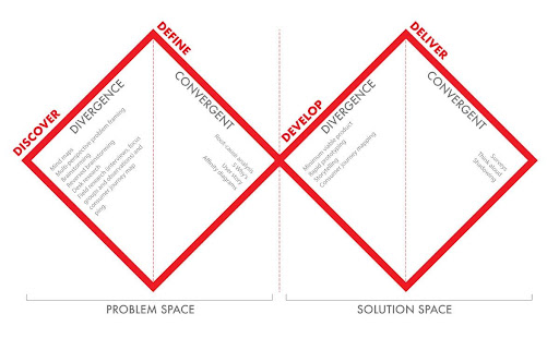
Figure 2. The Double-diamond framework. A process for identifying problems and creating solutions in US Design. Source: (Elmansy 2021).
Adopting this framework allowed us to propose a process to be followed for the UX design (Fig. 3). In our proposition, we would use data from both direct consultation and observation done with potential users – this would correspond to the “divergence phase” in our “problem space” step of the double-diamond. We are, then, left with more questions to be answered: who are our potential users?; and how would they use our website?
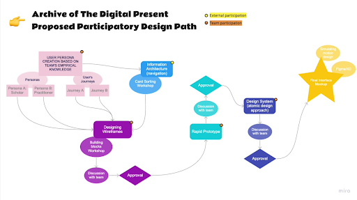
Figure 3. A diagram for the proposed participatory process of the UX design. Source: Screenshot by the authors.
UX Design Process: Phase 1
Starting our UX design investigations, a consultation with the ADP team established that this tool would have mainly two groups of users, therefore two “personas”: scholars and practitioners. Both would compose the archetypical audience, and our next step was to compile their characteristics, as well as their users’ journeys (actions they would perform on the website in order to achieve their goals). This was achieved through two workshops with the ADP team, themselves potential users, using our first online tools for remote participation. For the Persona workshop, we used Miro, an online collaboration platform well-known in the UX design world (Fig. 4). Participants of the team were asked to describe the personas in the following characteristics: (a) needs; (b) motivations to use the ADP platform; (c) skills; (d) interests; (e) professional characteristics; and (f) level of comfort with technology.
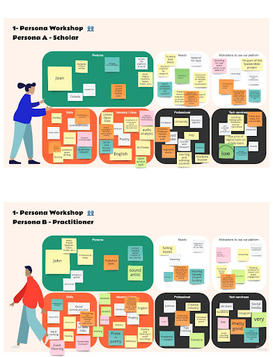
Figure 4. The Persona boards on Miro.com, completed by the ADP team. Source: Screenshot by the authors.
For the users’ journeys, we facilitated a second workshop with the ADP team. A template on Google Jamboard was drafted, and we asked the participants to fill it with digital sticky notes – emulating an exercise that is typically done in person, in a room with a whiteboard. Following our Persona workshop and the ADP’s team input, a user journey was proposed, divided into the most usual actions to be performed by users, for example, visiting the website, browsing, searching, viewing results, exporting, downloading, uploading, sharing and connecting. For all of those actions, the workshop participants (again, the team of ADP) were asked to fill the columns according to the swallowing rows: actions, questions, happy moments, pain points, and opportunities. Combined, the persona and user journey workshop provided some clarity and hints for us to continue our process of user-centred investigation. For the next phase, a survey and a first design workshop were then applied.
\Figure 5. The Users’ Journeys boards on Google Jamboard, completed by the ADP team. Source: Screenshot by the authors.A website was created to present the UX process to the participants, collecting links and displaying information about the research activities and workshops that would be part of the research. Initially, we had two activities that were part of the first phase of the design process: a survey applied to a pool of 24 respondents, followed by a card sorting activity that counted 30 participants total and 23 who finished the study.
The survey’s goal was twofold: to better understand the potential user of the ADP website and to understand their needs for this digital platform to tackle. Overall, it had general, demographic, and technical usage questions, followed by an investigation of the events they were involved with during the pandemic. The survey finished with questions about the potential for a tool such as the ADP and the team’s preferences about the data that would be displayed and available on the website.
Data collected in the survey was important to guide the following activity: a card sorting workshop. “Card sorting” is a recurrent and popular activity in UX research. In our study, it consisted of giving participants a series of 50 “cards” containing a series of potential actions regarding the content and the affordances of the future ADP platform. Participants are then asked to group those cards into categories and name them. This is a popular method to investigate how potential users classify and perceive information. It can provide important clues for creating an information architecture for a website or an application.
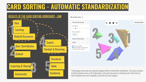
Figure 6. Results from one of the online workshops, with the automated interpretation of the card sorting exercise compiled by the user-experience tool Optimal Workshop. Screenshot by the authors.
Results from the card sorting study were then analyzed, and the responses were standardized by grouping similar classifications and finally consolidated through a series of different data analysis methods (dendrograms, a similarity matrix, and an algorithm that created a 3D cluster view of the cards and their classifications). The analysis of the results pointed to two possible information architectures containing punctual differences, one from another: one achieved by the manual standardization of the results; and one suggested by the automated classification algorithm of the online tool we were using, Optimal Workshop.
As the results were not pointing yet to one consolidated response, it was time to further re-test with our stakeholders and continue to refine and modify an information architecture based on the next phases of the UX design, the sitemap testing, and the first-click test.
UX Design Process: Phase 2
The next phase of the UX design was to test the results from the previous study and to start consolidating an information architecture that would form the first wireframe. The first consultation with our participants, at this point, was a sitemap test (also called tree testing). This type of A/B testing meant investigating further which of the two main responses we received on the card sorting exercise would perform better with our stakeholders, based on two main criteria: their success rate and their directness rate.
The sitemap test consisted of a list of 12 commons tasks to be performed on the future ADP site that was tested against the two different sitemaps we had at our hands resulting from the card sorting: one that was standardized and interpreted manually to create classifications that would form the IA of the website (A test), and the second one (B test) which relied on the automated resources of the platform we used, Optimal Workshop, to classify and point towards an IA.
The sitemap generated from the automated method (B test) had overall better results, despite smaller participation (6 participants finished the B test, against 10 participants who finished the A test) with a success rate of 85% (against 63% of the A test), and a directness rate of 71% (against 61% of the A test). This is not to say that defining the future information architecture of the ADP website resulted entirely from a formulaic test result. The form in which the workshops were conducted, with conversations with the users and analyzing their inputs, gave us enough content to generate insights for the UX design. One insight that came not specifically from a test result but rather from the overall accumulation of conversations and data collected in our process so far was a three-layered structure for the future website (Fig. 7). This would influence the design from this moment on.
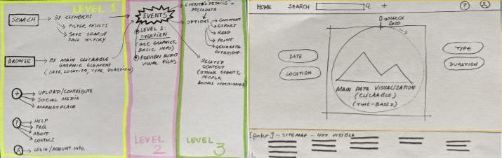
Figure 7. First sketches for the future ADP website information architecture and wireframe. Screenshot by the authors.
Those first sketches generated from the findings of the initial consultations were instrumental in building a low-fi (low fidelity, a term used in UX design to indicate initial sketches of a proposed design, preferably without further detail) wireframe. This was used for the first-click tests, in which our stakeholders were again asked to perform specific tasks by clicking on a low-fi “wireframe” of the website. The results could be seen as “heat maps” for where the participants decided to click. This feedback allowed us to test the design and the information architecture before detailing it further and allowing some corrections (Figure 8).
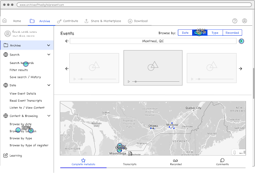
Figure 8. Results from the first-click test on the monochromatic wireframe. The image presents a heat map of areas that were clicked by the users while performing the task “search for events that were based in Toronto”, generated by the user-experience tool Optimal Workshop. Screenshot by the authors.
Figure 8 – Results from the first-click test on the monochromatic wireframe. The image presents a heat map of areas that were clicked by the users while performing the task “search for events that were based in Toronto”, generated by the user-experience tool Optimal Workshop. Screenshot by the authors.
UX Design Process: Phase 3
Following the evidence-based process for creating the low-fi wireframe, enough data was collected, allowing us to move towards a more refined and time-consuming prototype creation. Instead of relying on static mockup images of the web pages, we decided to explore creating this high-fidelity mockup to allow a deeper level of interactions for user testing. We decided then to use a no-code website-building platform named Webflow, and our mockup would be a partially functional website. This would allow us to follow our co-created concept and simulate the navigation in our three-layer proposed structure: First, the homepage invites the users to search and/or browse content related to literary events, relying on dynamic data visualization to present our database interactively to the user. Secondly, a dashboard overviews the search results or browsed topics. And finally, a dedicated page containing the metadata and all the information connected to the event.
This design phase was highly iterative; we created several versions of the mockup website to test internally and with our users throughout usability testing, which will be presented in more detail in the next part of this piece. We initiated with a simpler “monochromatic” look (in fact, mostly white, blue and grey, except for some figures that were inserted at this time) and added placeholder interactive data visualization (Fig. 9). Therefore, we started a process of honing the wireframe into a final tentative version – more elaborate visuals and colour testing were intentionally left for a later phase of the UX design.
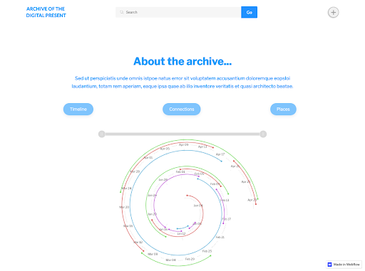
Figure 9. Screenshot of the homepage of version 9 of the ADP high-fidelity mockup. We can see significant elements that were incorporated into the design through our co-creation practice: the search bar, and the interactive data visualization. Screenshot by the authors.
Usability Testing
A key component in creating a user-center website is through user-testing or usability tests. In 1985, Gould and Lewis introduced three principles in producing user-centred design: “(a) early focus on users and tasks, (b) empirical measurement, and (c) iterative design” (Corry et al., p. 66). However, these were not enough; they later added a fourth principle in 1988: (d) integrated design. The main takeaway from Gould and Lewis’ four principles is that if you are creating a user-centred design, the user should have a role in the design process or, in Rubin’s case (1994), “the user should be at the center of the process” (Gould et al., 1985, as cited in Corry et al., 1997, p.65-66). As such, they should be involved in the creation of prototypes or interfaces by letting them interact with a wireframe of the site. These interactions should then be observed and noted by the designers, as the designer’s main goal is to create a site that is “usable and understandable” for the user (Gould et al., 1985, as cited in Corry et al., 1997, p.65).
Hence, through user testing, we are able to see how people will interact with our design, what areas should be replaced for clear navigation, and which areas are doing well or need further improvement.
To start, designers of the usability test should have clear goals in what they aim to achieve in finding from the users, which should also be clearly explained to users. Dumas and Redish (1993) also described five characteristics of every usability test (Dumas et al., 1993, p. 22, as cited in Corry et al., 1997, p. 66):
- The primary goal is to improve the usability of a product. For each test, you also have more specific goals and concerns that you articulate when planning the test.
- The participants represent real users.
- The participants do real tasks.
- You observe and record what participants do and say.
- You analyze the data, diagnose the real problems, and recommend changes to fix those problems.
Usability Testing in ADP
As such, for ADP, the goals outlined for our usability test were:
- Determine if users can complete core tasks within the wireframe
- Determine if the wireframe is challenging to use
- Investigate if the users find it interesting
Through a series of 10 “real” tasks:
- Introduction activity: Explore the website for a couple of minutes;
- Activity 01: Where would you go to look at the different hosting platforms?
- Activity 02: Search 2020;
- Activity 03: How do you feel about the icons?
- Activity 04: Find Information on Jason Christie;
- Activity 05: Download information from 2 events
- Activity 06: Find events organized by the University of Ottawa
- Activity 07: How do you access the details of an item?
- Activity 08: Find the Facebook page of the “All I Ask” Event
- Activity 09: Where would you go to share the data of an event?
- Activity 10: Where would you go find the citation of the event
The number of clicks, the difficulty of navigation, and the user’s ease and comfortability would all be considered by the designers. Unlike Dumas and Redish, however, the designers included another aspect in the goal section that emphasized the user’s emotional sentiments. For example, how they felt when performing a specific task, whether they felt a sense of satisfaction or expectation met when completing a task successfully, or whether they felt confused or discouraged when they were unable to complete it. As a result, the users’ emotions and interactions reveal a new component of the wireframe that must be updated or improved, such as font sizes, colours, or symbols.
A Peek into the Usability Research
For the ADP, the designers interviewed four participants and recorded the sessions. After each activity, the participants were asked how they felt and if their expectations were met. Based on these reactions, the designers noted any comments related to the task and their satisfaction levels. The figure below shows the moods and comments of three participants (audio was lost for the fourth participant) during all ten activities.
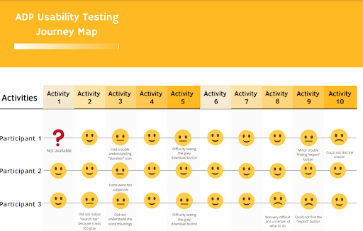
Figure 10. Summary of the journey map usability test. Source: Illustration by the authors.
Results of the ADP Usability Test
The following diagram presents the main findings and observations that all the participants had comments or concerns about when interacting with the wireframe. From here, the designer would create new options to improve the design to meet the users’ needs.
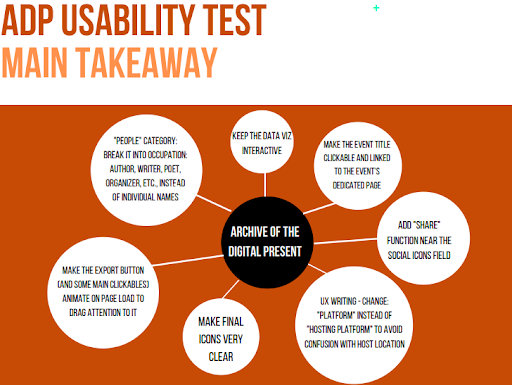
Figure 11. Main takeaway of the usability test. Source: Illustration by the authors.
Takeaways from adopting Usability Testing
Due to the language, framework, and keywords used in archival websites, it might be difficult for users to find content. As a result, usability testing with a variety of potential users allows for a more inclusive site that is usable and effective for a wide range of users. For example, during the usability test, the designers discovered that one target/potential participant who works with books did not know where to look for the citation button because citing resources was not something they performed frequently. Another participant, on the other hand, was a librarian who recognized right away to look for a citation in the “export” button because it was a common language term in her field. Designers must learn to make a site user-friendly, and the best way to do so is to interact and observe “real” people performing “real” tasks. As a result, the website will have a more personal touch, transforming it from a site that seeks an audience to one that already has one within its frames.
Final Results
The initial outcome of the PD process was the creation of three-level information architecture for the prototype of the front-end design: starting from the first stage, an overall glimpse at the directory of events on the home page, presenting the content on the form of visualization and quick browsing functions for interacting with content. From the homepage, the user is taken to the second level of the information architecture, in which content is presented on either a dashboard or in the form of lists in pre-established categories, displaying more information and details and introducing different filters for the content. Finally, the third and final stage of the information architecture is the detailed access to the metadata, which can be visualized, exported or shared. Through all of those stages, the front-end design allows a search function to be performed for direct access to the directory of events.
Once the information architecture was established, the participatory approach to design expanded to the final look of the prototype. At this phase, participants from both the team and stakeholders were invited to guide the visual design, as they were asked to reflect upon their perception of the pandemic and to present keywords that would represent this period. The final prototype was then designed to reflect on this perception, drawing from the participation to inspire and establish the mood board for the design work, which directed the design decisions to achieve a final result that aims to be characteristic of its particular time.
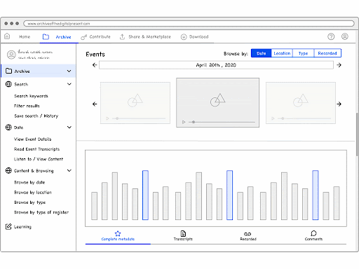
Figure 12. The evolution of the wireframes to mockups of the ADP website, according to our user feedback. GIF created by the authors.
The proposed visual design incorporated SpokenWeb’s palette of colour onto a “dark mode” background – one of the web design trends of the 2020-2022 period, and that also reflected the overall mood of this pandemic period. Keywords given by our participants such as “time”, “anxiety”, “new normal”, “screen”, “death”, “longing”, etc. inspired the design. The icon created for the ADP explores an animation that makes reference to a clock marking the time, and the colour scheme achieved reflects the autumnal melancholy of a period in which silence and decay of the disease, and the measures surrounding it, loomed over the world.

Figure 13. The landing page, above the fold screenshot. Emphasis on the search bar, and interactive infographic that serves as a content browsing tool. Screenshot by the authors.
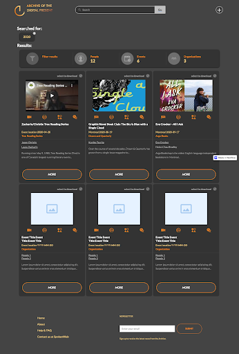
Figure 14. The dashboard page, returning the results of a search for 2020. A brief summary is presented to the user, who can click to read more about an event. Screenshot by the authors.
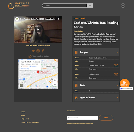
Figure 15. The detailed event page, with the metadata, all the content and links regarding the selected event. Screenshot by the authors.
References
Elmansy, Rafiq. 2021. “The Double Diamond Design Thinking Process and How to Use It.” Designorate (blog). September 1, 2021. https://www.designorate.com/the-double-diamond-design-thinking-process-and-how-to-use-it/.
Norman, Donald A. 2013. The Design of Everyday Things Revised and expanded ed. New York, New York: Basic Books.
Sharp, Helen, Yvonne Rogers, and Jenny Preece. 2019. INTERACTION DESIGN: Beyond Human-Computer Interaction, 3rd Edition. 3rd ed. Indianapolis: Wiley. https://learning.oreilly.com/library/view/interaction-design-beyond/9780470665763/.
Spinuzzi, Clay. 2005. “The Methodology of Participatory Design.” Technical Communication 52 (2): 163–74.
“User-Centric Design: Website Trends in 2016.” 2016. Engage. November 1, 2016. https://enga.ge/user-centric-design-website-trends-2016/.
Vermeeren, Arnold P.O.S., Virpi Roto, and Kaisa Väänänen. 2016. “Design-Inclusive UX Research: Design as a Part of Doing User Experience Research.” Behaviour & Information Technology 35 (1): 21–37. https://doi.org/10.1080/0144929X.2015.1081292.
Corry, Michael D., et al. “User-centered Design and Usability Testing of a Web Site: An Illustrative Case Study.” Educational Technology Research and Development, vol. 45, no. 4, Springer Science and Business Media LLC, Dec. 1997, pp. 65–76, doi:10.1007/bf02299683.
Alexandre Bustamante and Eva Lu

Alexandre Bustamante works as a Service Designer for ISED – Innovation, Science and Economic Development, in the Government of Canada. He is a Master of Design student at Concordia University with previous degrees in Architecture and Design Arts. As a member of the SpokenWeb team, he works as a UX (user experience) Designer for the Archive of the Digital Present project, facilitating a participative, user-centred design for the online platform. Besides that, he researches Service Design, UX and Interaction Design for education on digital media literacy and disinformation awareness.
Eva Lu is a recent alumna of the University of Toronto’s Faculty of Information with concentrations in Library Science, Archives, and UX Design. She is currently employed in Italy as a digitizing assistant and as a librarian at the International Centre for Theoretical Physics. She previously worked as a research assistant at Victoria University in the University of Toronto, producing records for the Earle Toppings Collection for SpokenWeb, and later assisted Alexandre in the UX Design of the Archive of the Digital Present project. She is interested in the circulation and preservation of information, especially those that are digital.